The Guest Room
Some of you may not know, but our home was actually my child hood home! I lived here from about age 6-18 until I moved out! I’ve always loved this home, and at 26 I came back, with a husband and 2 babies, and so happy this home was ours! I have the best memories of growing up here and it means the world to raise our kiddos here and watch them make memories!
The reason I bring this up is because of the back story on the guest room! Way back in the day, this was my sisters room! We have the best parents in the world and they let us both paint our own spaces whatever color we wanted! I was feeling moody and opted for a deep wine red, and my sister was feeling. . . well, IDK, but she opted for hot pink with leopard print. 10 years later, and that was still the situation in this untouched room that we had turned into a kind of storage unit!
I always knew I wanted this room to be a guestroom and with an upcoming house appraisal, it was the time to knock it out and try and stop the pink leopard room from hurting the value of the house! LOL
Here are some before shots! (Note Leos head in the second pic. In this house, no one gets to renovate alone!)


Here is the After!!!!

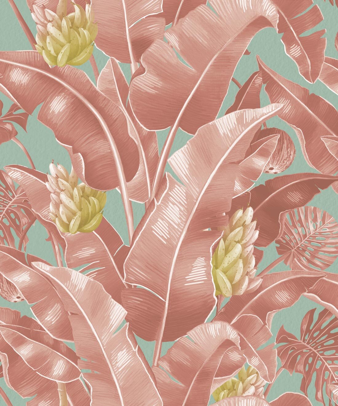
Obviously the very first step was to take care of the paint! I am such a big fan of wallpaper and I haven’t wallpapered a room in quite some time, so I knew that’s what I wanted to do! I was super excited to team up with Milton and King for some wallpaper for this space! I was choosing between 2 prints! Jungle Tiger and Kingdom Palm! Jungle tiger was my initial choice, but the room doesn’t get a ton of natural light and I didn’t want to do something too dark, so I ended up going with Kingdom Palm in Pink and I’m so happy I did! They have such great quality papers and it was so easy and seamless to install!

Once I had picked the wallpaper I picked a paint color for the opposing walls! I wanted something pink to play with the wallpaper but not too pink, so I went with Iced Cherry by Behr! I think its the perfect color in this space and nice and subtle and gives all the attention to the wallpaper!
A lot of my choices thus far were based on the bed from Joybird that I had chosen for the space! I went with the Connor Bed in the limited Antonio Boysenberry fabric and it was the piece that basically inspired the entire room! I have so many different furniture piece from Joybird and I can’t say enough good things about this brand and this bed is no exception! I love the way that it looks against the Milton and King wallpaper and the velvet is the perfect pop of glam!

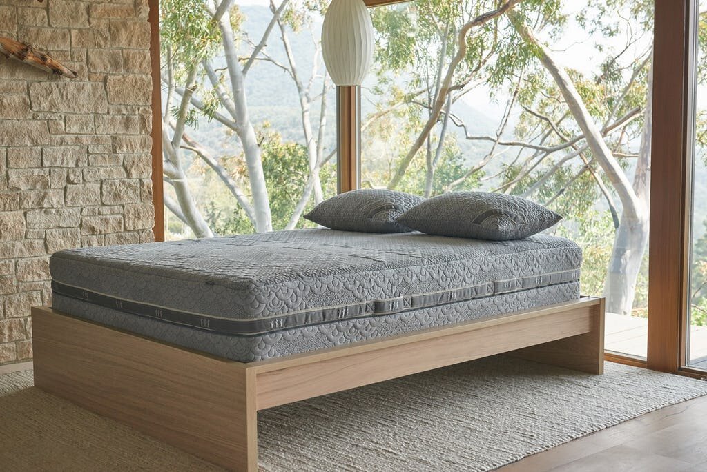
For the mattress I went with the Crystal Cove Mattress from Brentwood home! As much as aesthetics are important, I think that the most important part of a guestroom is the mattress! It’s always the worst when you stay in someones home and the mattress is terrible! This mattress is a dream and we might even have to snatch one up for our room!
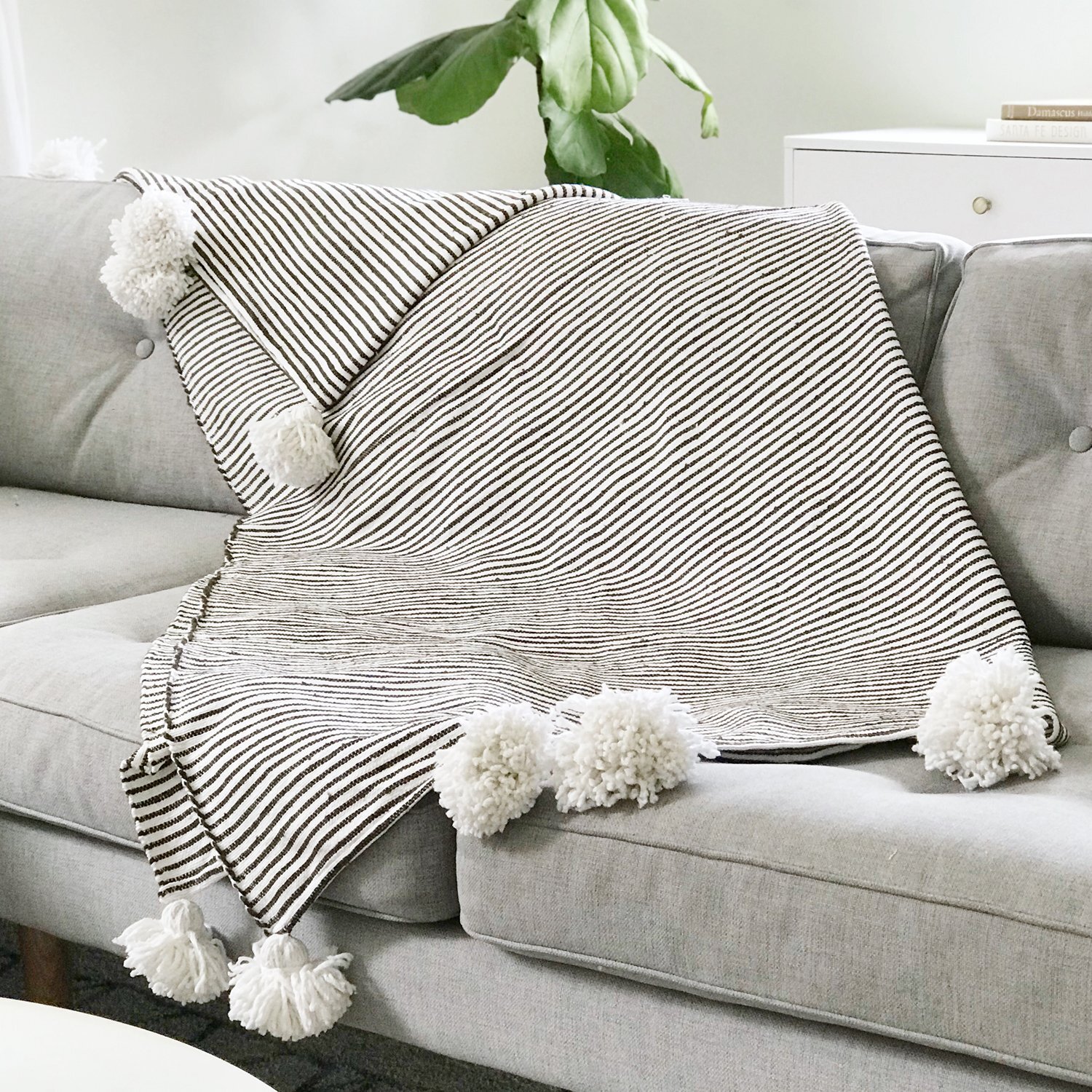
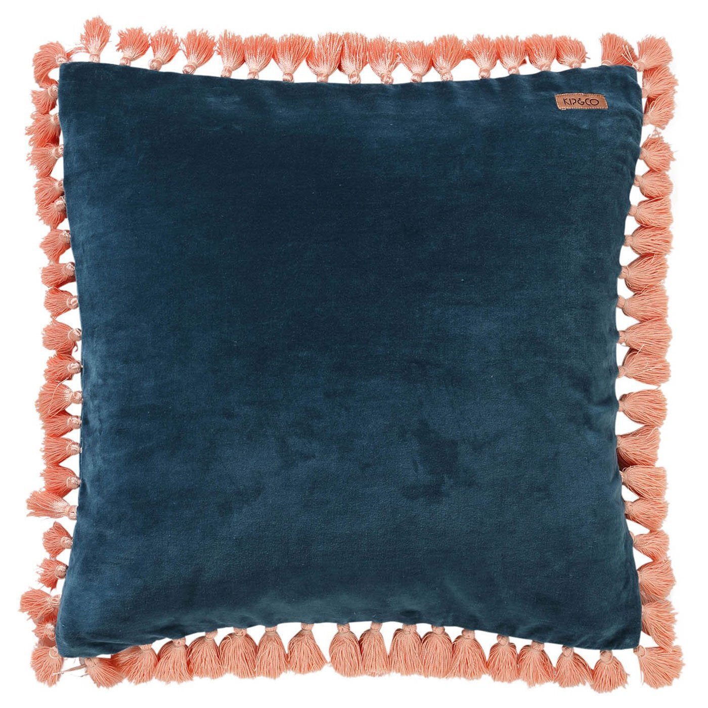
With such a pretty bed, I knew I needed some pretty bedding to match! I teamed up with my friends at Paynes Gray and grabbed some fun bedding to really make the room pop! I went with the Teal Velvet Duvet Cover in queen and the Teal Tassled Throw Pillows to match! I wanted to keep the bedding pretty simple because I had so much wallpaper, but I did add a fun stripped and tasseled throw blanket to break up some of the solid bedding!

For the rug, I went with my all time favorite rug brand, Revival Rugs! I loved the pops of minty blue in the wallpaper so I decided get a rug to play off of that color! This particular rug is one-of-a-kind vintage, but they have a ton of similar options on their website! Use code “ARIANNA_DANIELSON10” for a discount on any rug from their site!

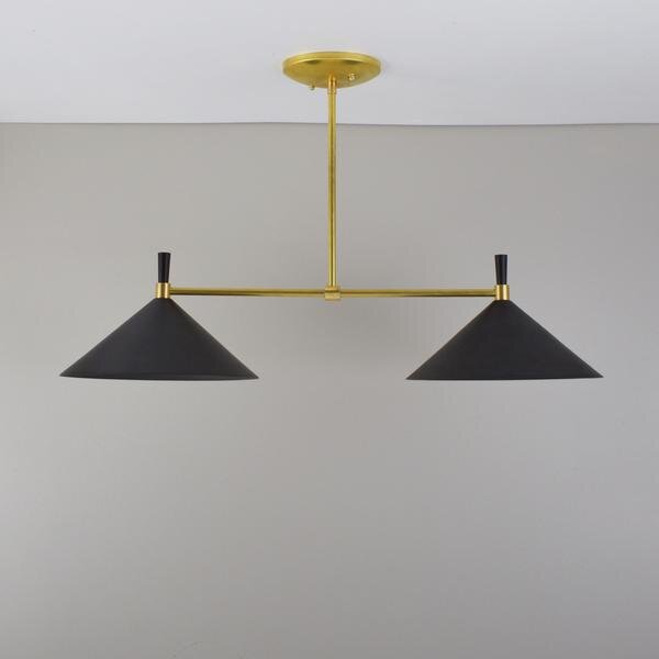
This room also had a really old ceiling fan and I wanted to opt for some pretty lighting instead! I went with the Double Cone Chandelier from my favorites over at Pepe and Carols Handmade! I have a lot of different pieces from them in our home and they never disappoint! I am so happy I went with the black! I wanted something that would give a big pop of contrast against the ceiling and the rest of the room and I think this piece did just that!

Lastly is the closet! The closet had some old metal doors on it, so first I decided to take those off and add some curtains! The curtains are Opalhouse from Target and I think look so much better than the old doors! For the inside I decided to paint and used a shade that I though was similar to the Antonio Boysenberry fabric on my Joybird Connor bed! I almost got rid of the shelf inside the closet, but it actually has some sentimental value. I vividly remember coming to see this house with my parents when they were house hunting. My sister and I had run off and were exploring the house when we came into this room and just DIED over the pink shelf. We fought and fought over who was going to have the room with the pink shelf, and in the end we both ended up having it at one point! I just couldn’t bring myself to throw it out, so I painted it and added some fun guestroom stuff to all the shelving!I the perfect place for some trinkets, towels, waters, extra blankets and stuff like that!


I really am sooooo happy with how this space turned out and have definitely been escaping to this space pretty often! Thank you to all the brands who partnered on this project! Now who wants to come stay over?!?!
Linked!